Motovun Film Festival
Motovun Film Festival’s new visual identity
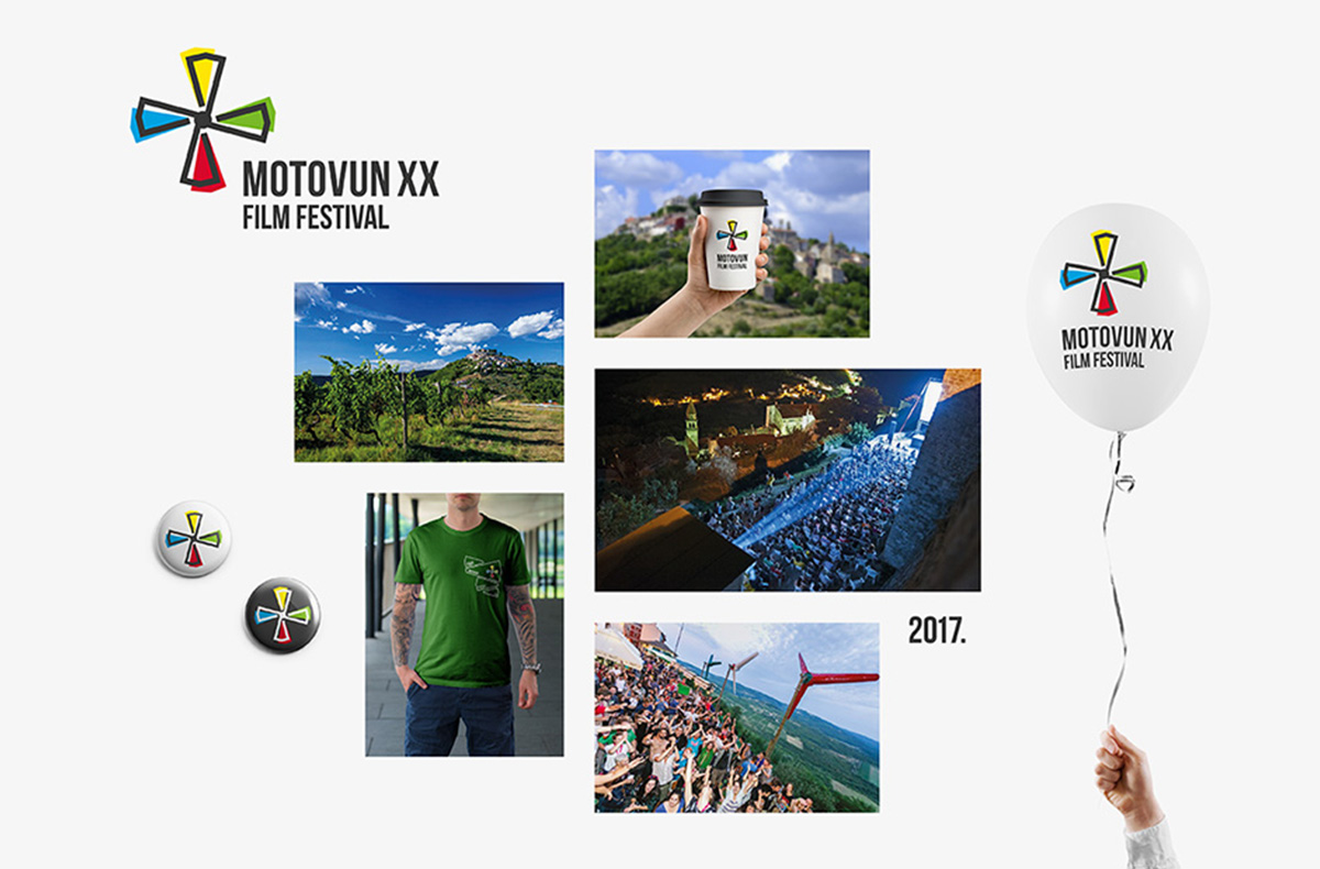
Motovun Film Festival’s new visual identity summarizes 20 years of its existence and was designed by the agency Bruketa & Žinić OM, which stands behind the first visual identity of the festival 20 years ago.
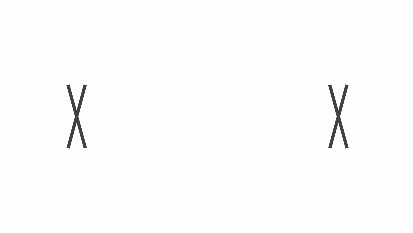
The new solution is based on the idea of animation of Roman number XX, which provides a constructive basis for the rebuilding of the well-known Motovun propeller, a symbol of constant movement, vibrancy and animation.
Client:
MFF
MFF
Creative Agency:
Bruketa&Žinić&Grey
Bruketa&Žinić&Grey
My Role:
Visual Identity
Visual Identity
Date:
2017
2017
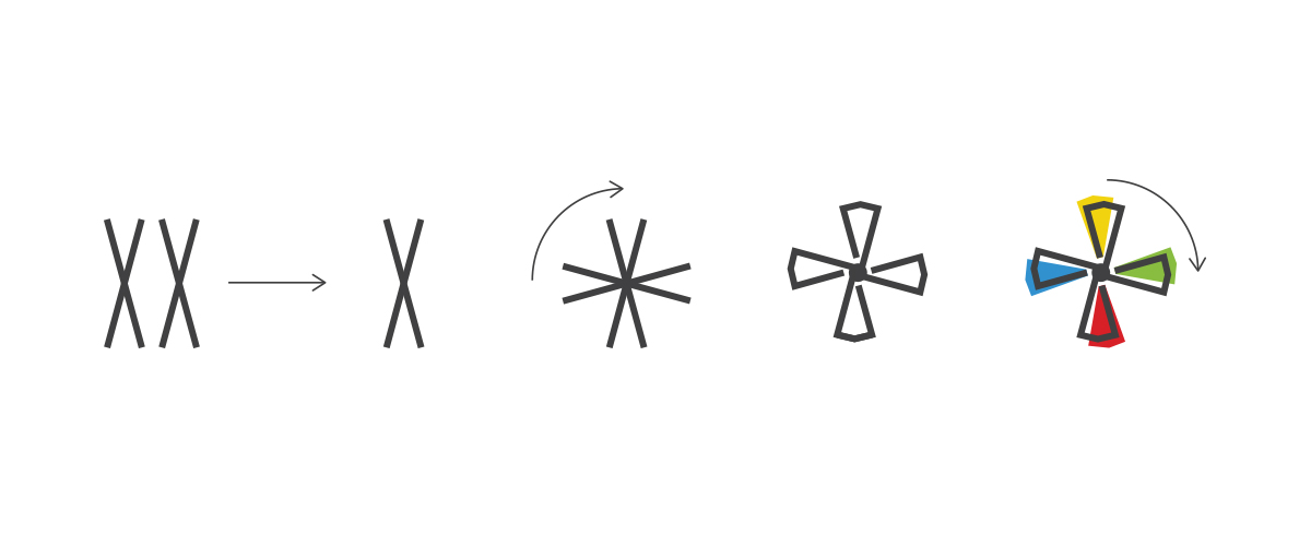
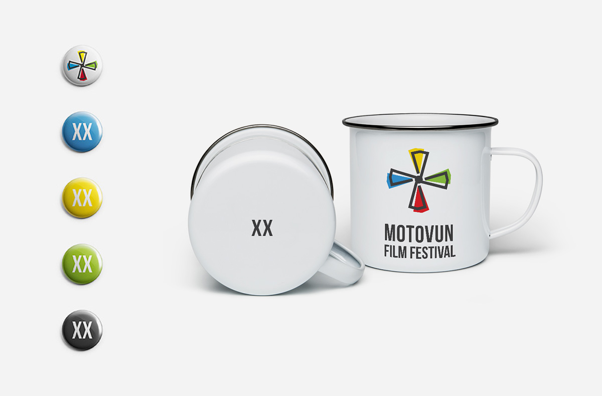
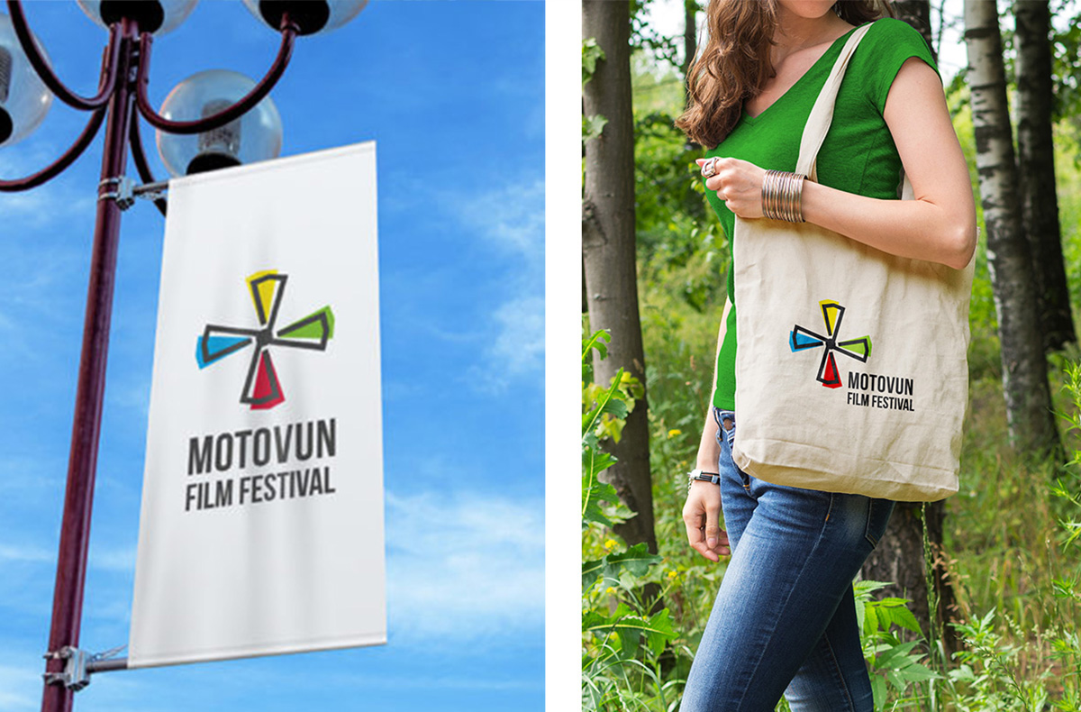
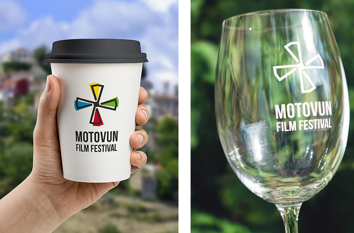
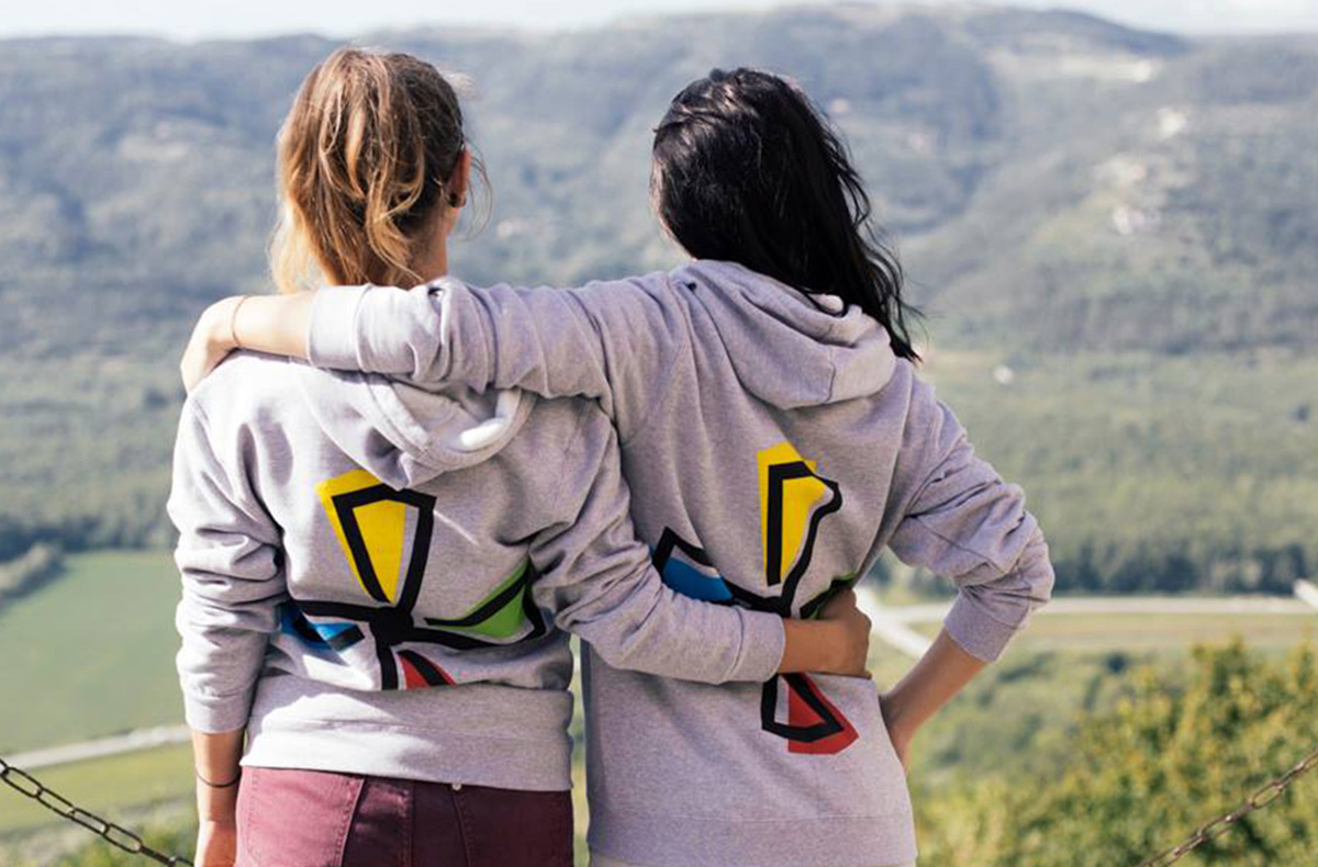
Colors
The continuity of all of the festival’s identities so far is rounded off by the use of four primary colors for the four blades in the spin. The sign is conceived and designed to be universally applicable in all media, and its original domain is a screen on which its dynamism comes to light.
Typography
Open source typography Bebas Neue supports the open character of the festival, which knows no boundaries and contributes to the overall contemporary identity character intended for international audiences.